Project Description
I redesigned Poloniex's wallet experience to streamline the on-ramp to the exchange and reduce deposit and withdraw related support tickets.
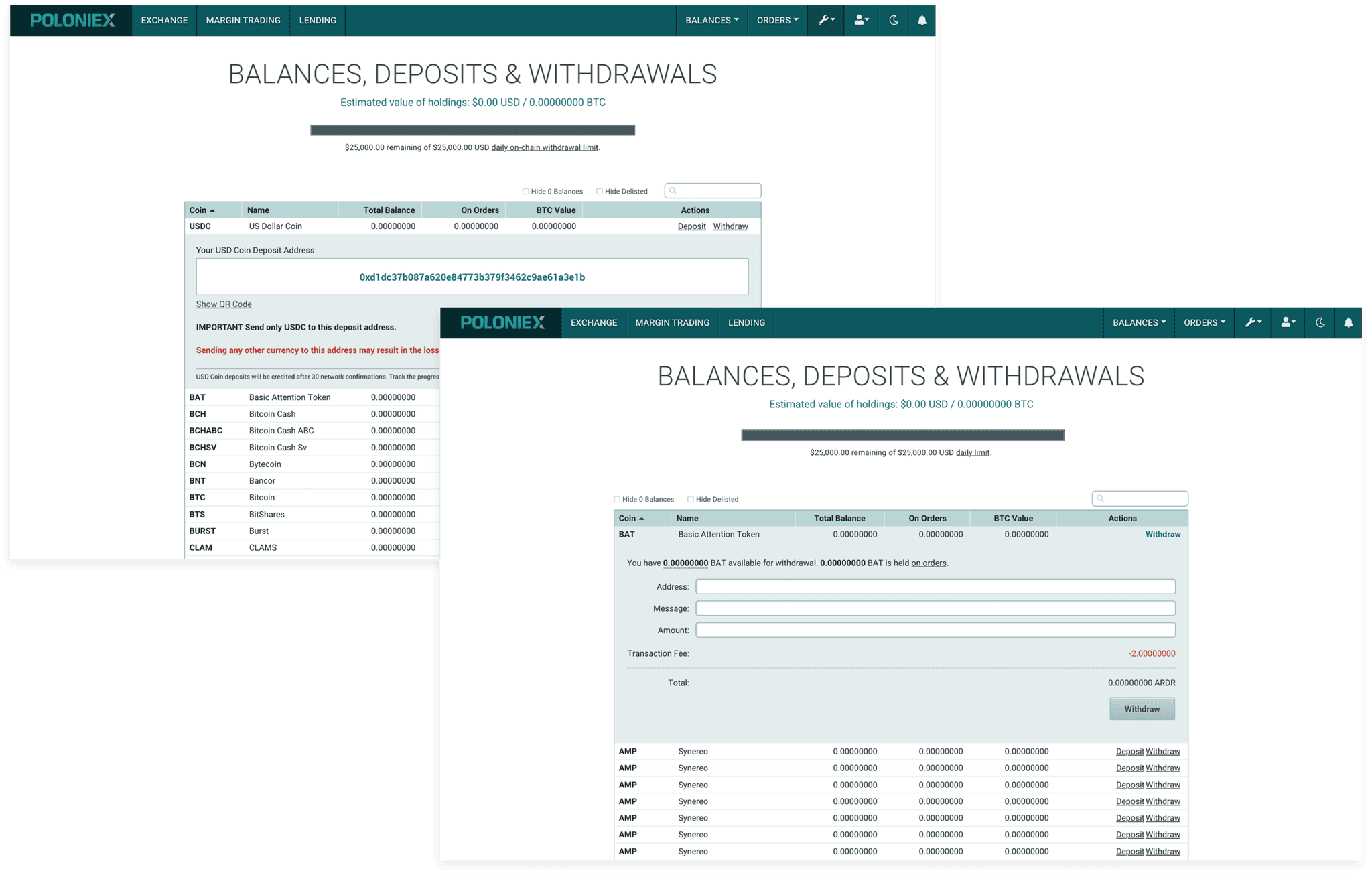
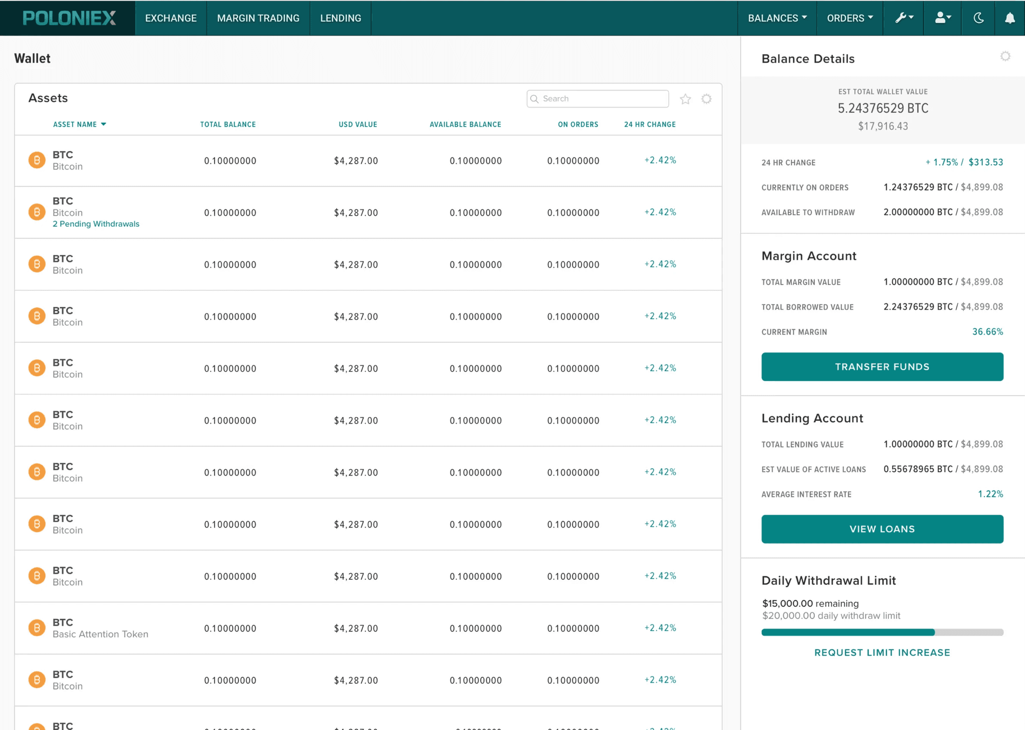
Poloniex's wallet functionality lived on the "Balances, Deposits & Withdrawals" page. Customers used the crucial features to deposit funds before trading on the exchange, but the page was difficult to use and error prone. Throughout the project, I designed three rounds of wireframes with new interaction patterns that put more focus on individual assets so that users were confident they were depositing to the correct address. I led concept and usability tests with current users to select a final design.
Key Achievements
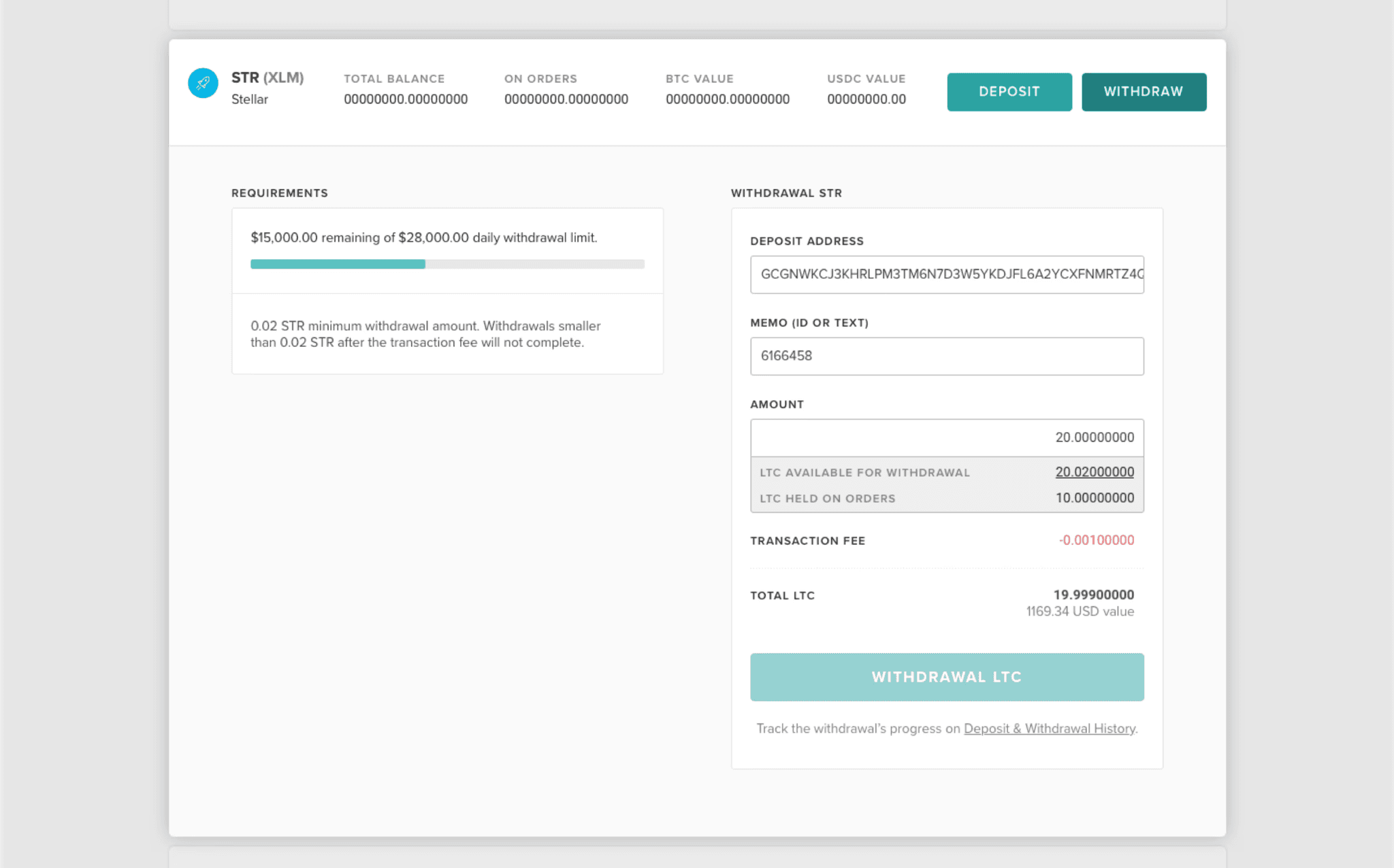
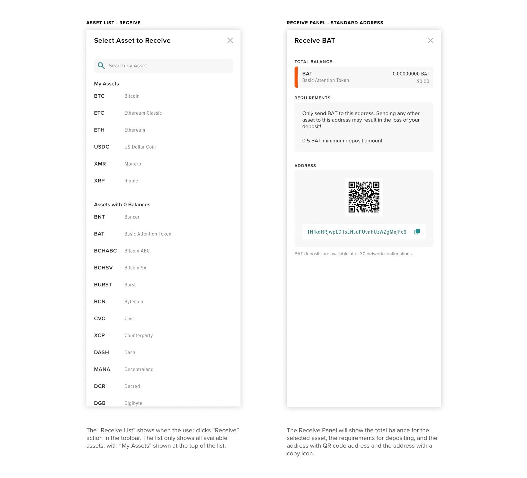
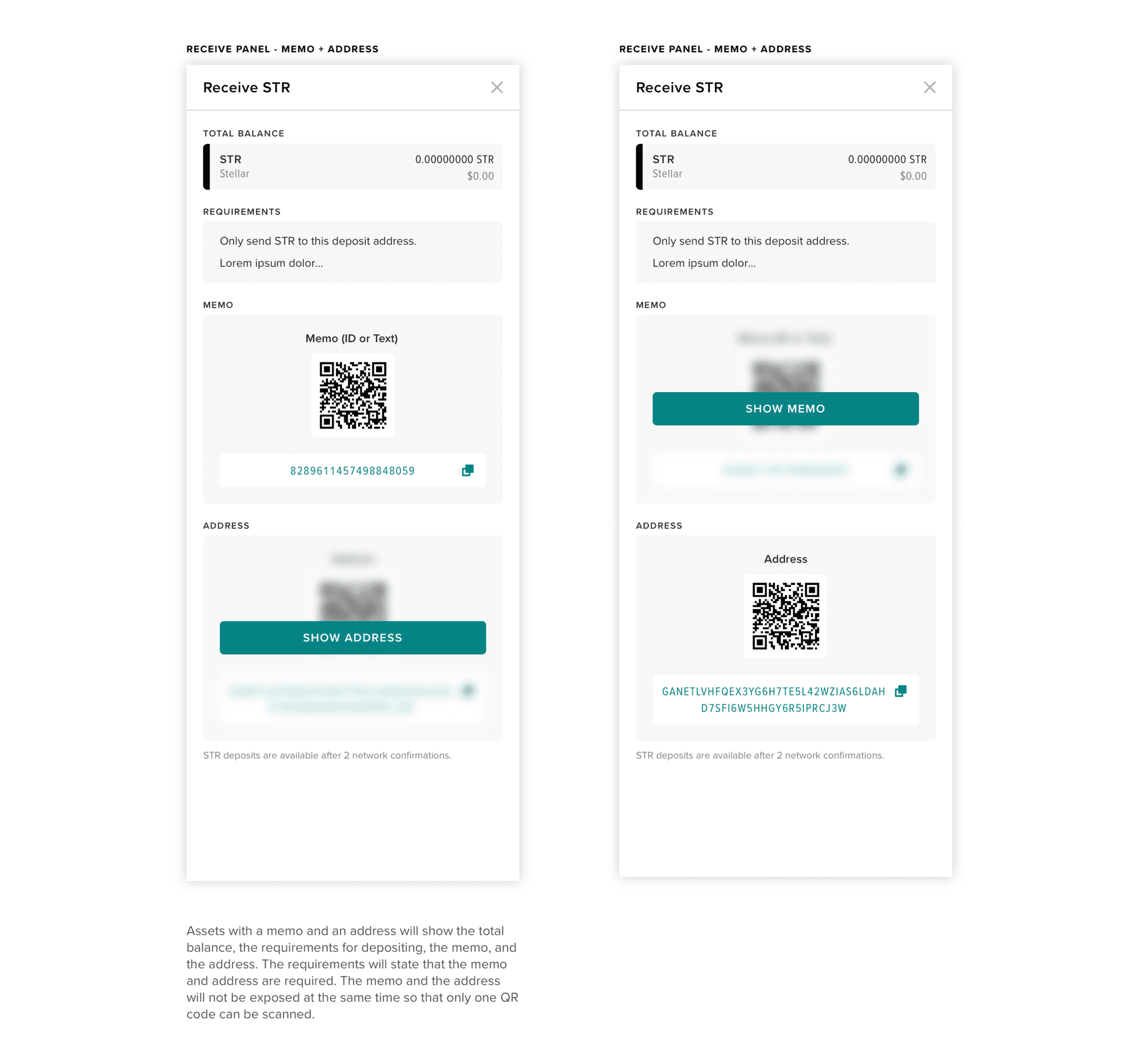
Reduced reliance on 3rd party "how-to" guides by introducing deposit and withdrawal requirements for each asset.
Reduced customer support tickets related to deposits and withdrawals allowing support team to focus on higher priority asks.
Demonstrated value of user research and testing to skeptical product team leadership.
The Deposit & Withdraw Problem
When Circle acquired the cryptocurrency exchange Poloniex in early 2018, the company took on a huge backlog of support tickets. The customer support team diligently worked through the backlog, but tickets related to failed deposits and withdrawals stacked up.
The "Balances, Deposits & Withdrawals" page was notoriously error prone. As I learned to trade from YouTube tutorials, crypto influencers often commented about failed deposits and withdrawals due to selecting the wrong deposit address or not meeting minimum requirements to withdraw.
3 Main Issues
Tight Table Rows for Each Asset
Users often selected the asset above or below their intended coin due to the small target size. If users selected the wrong deposit address, the currency would never arrive in their wallet.
No Asset Specific Instructions
Poloniex listed over 70 assets and each coin had unique deposit and withdrawal requirements such as minimum amounts. Requirements were not listed in the UI so thousands of users submitted support tickets asking for assistance.
Disconnected from Trading Data
The basic functionality of the page did not include any information about the performance of the asset on the exchange. Users were not prompted or incentivized to trade or lend their assets.
Goals & Approach
At the time, the product team leadership believed that crypto users would not be willing to participate in research due to privacy concerns. I watched YouTube tutorials to learn work-arounds and worked with the customer support team to understand common complaints from support tickets.
When customers sent assets from another wallet to Poloniex, they intended to trade on the exchange or lend in the margin account to earn interest. If the asset did not arrive due to a mistake, customers would be extremely frustrated and submit support tickets and complaints on social media.
I created three goals based upon the my meetings with the support team and complaints on social media to guide the project.
I reviewed the goals with the product management and engineering leads, and we defined a our approach to kick off the project. We agreed to use existing data sources and not incorporate additional sources like the trading API in the first round of design.
1
Define consistent interaction patterns and messaging like deposit and withdrawal limits for all assets
2
Reduce customer support tickets related to incorrect deposits or withdrawals
3
Encourage trade activity by introducing data from the exchange
Design Exploration
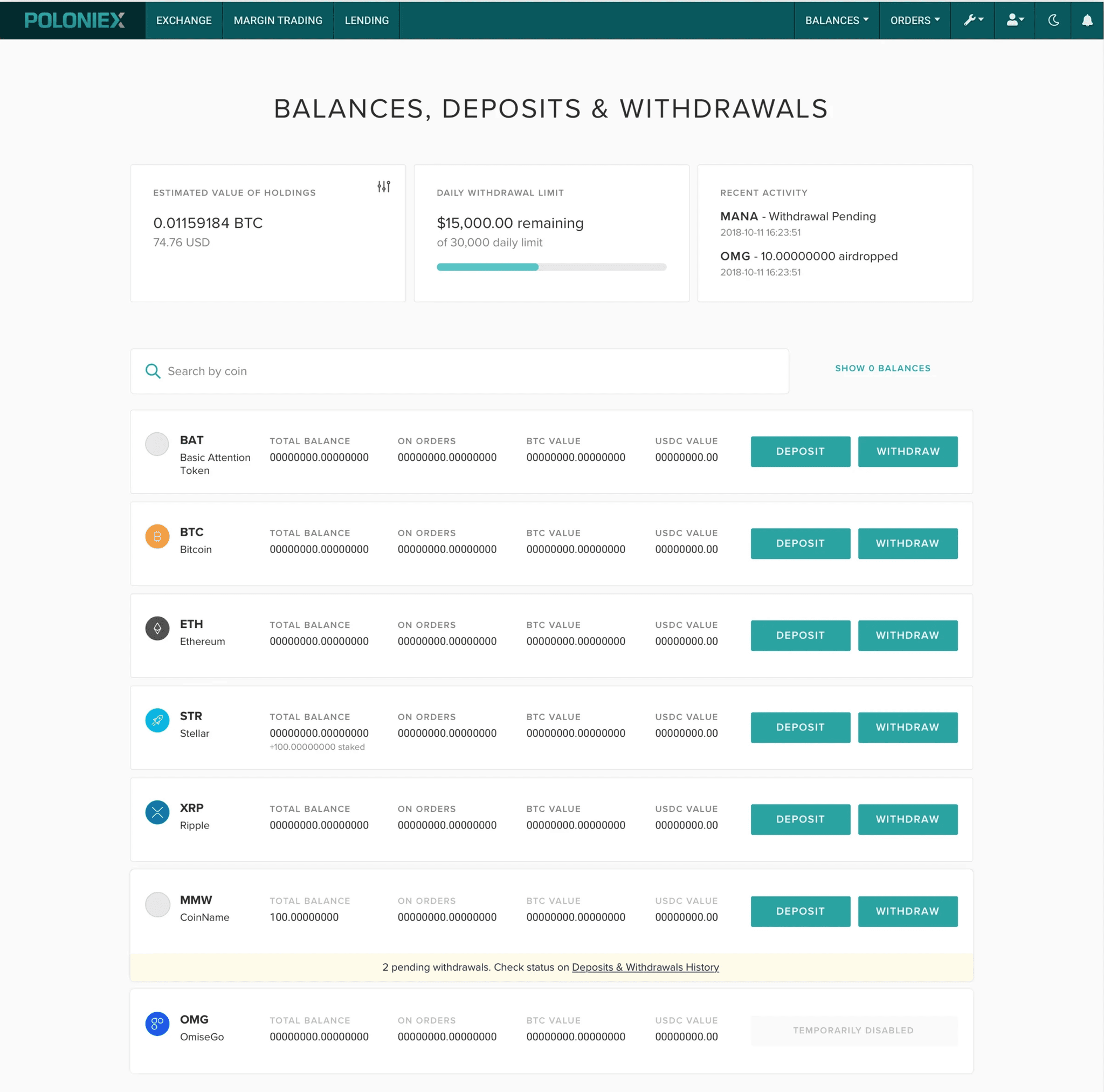
The first round of wireframes directly addressed the usability issues identified in the current experience. I increased the target size for selecting deposit or withdraw for each asset and added detailed asset requirements.
I met with 5 internal Circle users to review and gather feedback on the new wireframes. I asked participants to complete tasks related to identifying assets, depositing to an address, and withdrawing a specific amount.
Participants appreciated the wallet requirements. Several commented that they had to contact customer support in the past to get help with a withdrawal that was stuck due to not meeting the minimum requirements.
Participants commented that the wider asset rows made it easier to know they were selecting the right asset and they understood how to complete the tasks.
Participants wanted more insight into the status of their deposits and withdrawals while processing so they knew when funds would be able to be used.
Round 1 Findings
All participants reacted positively to the asset requirements and larger targets for the deposit and withdraw actions. But since the layout and interactions were the same, participants felt that the wireframes were not that different from the current experience.
Design Updates
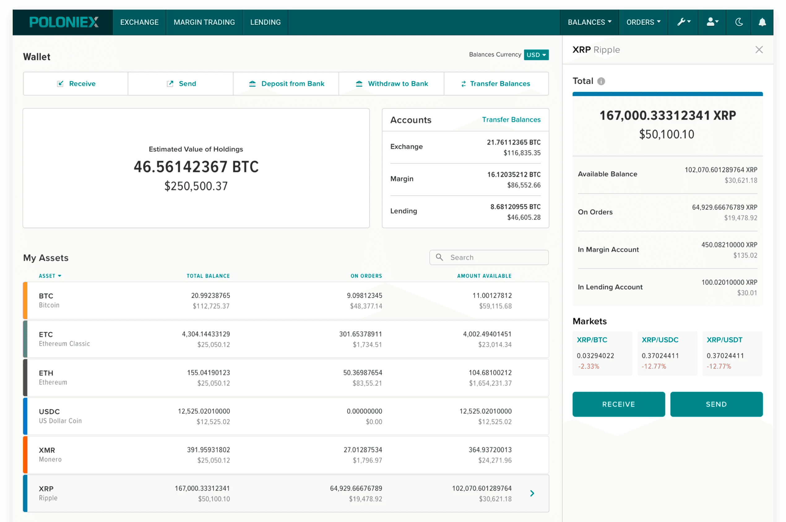
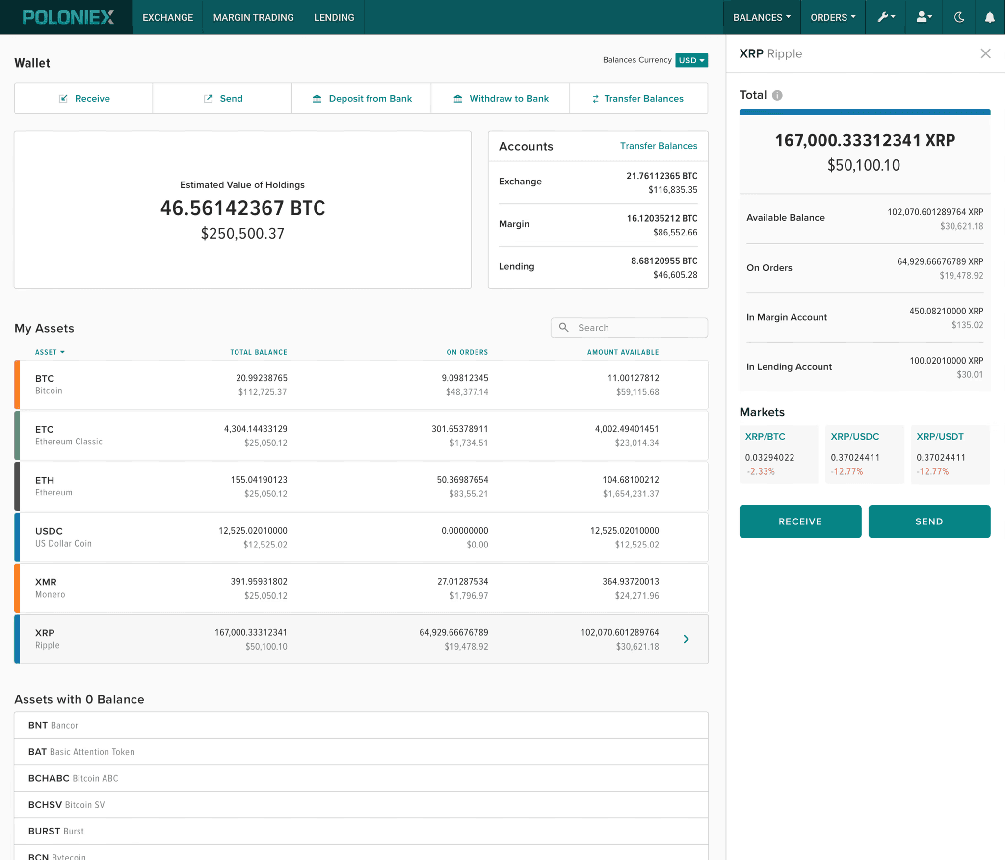
After testing the first set of wireframes, I wanted to push the concept and introduce new interaction patterns that enabled users to focus on individual assets.
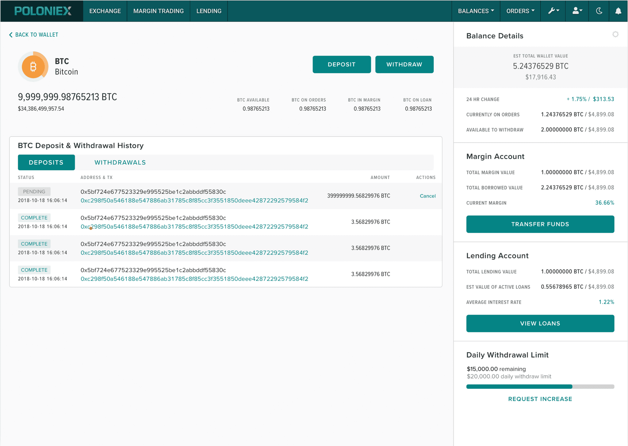
I incorporated data about the deposit and withdrawal history within the asset view based on feedback from the first round of wireframes.
Participants felt that it took “too many clicks” to get to the deposit and withdrawal actions. Slowing down the traders' workflow could potentially have major impacts on the exchange's volume.
Participants liked seeing the deposit and withdrawal history on the asset detail view, but felt that the trade and loan history should be shown alongside that information.
Participants found the detailed information on the Margin and Lending accounts to be out of place on the wallet landing page.
